A good reception area does three jobs at once: it tells visitors who you are, it shows them where to go, and it gives your team a desk that works all day. In Zürich, where clients, candidates and partners often arrive straight from a tight meeting schedule, those first minutes in your entrance count. This guide walks you through the decisions that matter, from layout and desk height to lighting and Swiss accessibility requirements, so your reception feels welcoming and professional rather than merely decorated.
Upscale Interiors
Plan a Reception That Works
Upscale Interiors designs tailored commercial spaces, with space planning, material selection and project management for your office entrance.
TL;DR
- Plan the zones first (greeting, waiting, information, circulation), and only then choose furniture.
- Design the desk for both sides: a tidy, well-equipped workstation for staff and a barrier-free option for visitors, with the SIA 500 manoeuvring space of 1.40 m by 1.70 m in mind.
- Use layered, warm lighting instead of a single bright ceiling grid, and make sure the space ties into your brand.
- Keep seating out of the walking routes and offer different seat heights.
- Bring in an interior architect early, because the reception desk is hard to change once the walls are up.
Why the reception area deserves your attention
Visitors start judging an organisation almost the moment they step in. One design guide puts the window at the first seven seconds, which is a rule of thumb rather than a law of nature, but it matches what we see on site: people read tidiness, light and signage before anyone has said a word.
That is good news. It means you don't need a huge budget to make a strong impression. You need an entrance that feels organised, bright and clearly yours. A Swiss company blog on office furnishing describes the same idea: order, clear guidance and a friendly atmosphere that reflect the company's identity create a feeling of security and trust.
The people at the desk matter just as much as the furniture. Design can't replace a warm greeting, but it can make that greeting easier: a desk that lets staff look up and make eye contact, a seating area that doesn't feel like a corridor, and lighting that is kind to everyone's face.
Start with purpose, size and visitor flow
Before you look at a single desk, answer four practical questions:
- Who arrives? Clients for a 30-minute meeting, couriers, job candidates, patients, or a mix?
- How many at once? Two visitors on a quiet day, or fifteen before a board meeting?
- What must staff handle? Check-in, phones, parcels, key cards, meeting room bookings?
- What do you want visitors to feel? Calm and discreet, creative and open, or formal and established?
The answers shape the plan. A law firm, for example, needs discretion and a quiet waiting zone, which is why we pay close attention to sound and sightlines in our law office design tips. A start-up may want a lounge feel with a small counter.
Zone the space
Professional reception design usually has clearly defined zones for greeting, waiting and information, with an organised layout and efficient flow that guides visitors without signs on every wall. Space planning guidelines from a university also recommend well-defined circulation routes and, where possible, a higher volume of space at the entrance, so the area feels open.
In practice, we sketch four zones:
- Arrival: a clear view of the desk from the door, with space to pause and take your coat off.
- Greeting: the desk or counter, positioned so staff see visitors as they come in.
- Waiting: seating that is close enough to feel connected, far enough not to crowd the desk.
- Onward routes: an obvious path to meeting rooms, lifts and toilets that never crosses the waiting area.
If you are planning a whole floor rather than just the entrance, the principles in this practical office space planning guide apply: zone the lobby and map circulation before you position any furniture. Our own checklist for the wider office is in five questions to answer when planning an office.
A simple worked example
Imagine a 40 m² entrance in a Zürich office on a single floor of a shared building. The door opens onto a corridor on one side and the lift lobby on the other. We would place the desk at an angle to the door, so staff see arrivals without sitting with their backs to a wall, keep the waiting zone in the quieter corner away from the meeting room doors, and leave a clear diagonal walking line from entrance to the first meeting room. The desk becomes the anchor, the lounge corner becomes the pause, and nobody has to ask where to go.
The reception desk: function, ergonomics, accessibility
The desk is where design meets daily work. The best ones are built around what the person behind them actually does, which is why we always ask the receptionist, not just the managing director, how they use the space.
For your team
- Storage: closed, discreet storage for paperwork, supplies and parcels. A clutter-free desk looks more professional, and cables and printers belong out of sight.
- Technology: plan sockets, data, phone and screen positions at the drawing stage, not after delivery.
- Sightlines: screens should not turn staff away from visitors.
- Comfort: a chair that adjusts properly and enough knee space for a full shift.
For your visitors
In Switzerland, barrier-free design is not a nicety. The SIA 500 standard governs obstacle-free buildings, and according to the professional body Architecture sans obstacles, reception counters in hotels, consultation and sales settings should be usable by everyone, including from a seated position. The same page states that at least one barrier-free workstation is required, with a horizontal manoeuvring area of at least 1.40 m by 1.70 m on the client side.
A common solution is a two-level counter: a standing-height section for quick enquiries and a lower section where a wheelchair user, or anyone who prefers to sit, can talk face to face. Exact heights, the signage height and the tactile guidance that may be required depend on your building type and its permit, so confirm them with your architect or the local building authority before you order a custom desk.
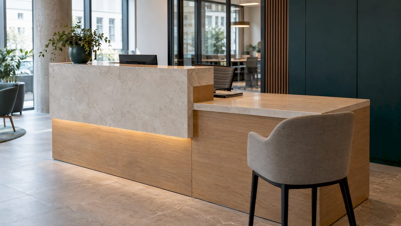
There is also a fire-protection point worth knowing for public buildings: upholstery and coverings may have to meet specific requirements, so check the material specification of any sofa, panel or acoustic covering with your planner before you fall in love with it.
Desk shapes at a glance
Seating and waiting: comfort without blocking the way
A waiting area works when people can sit, look around and feel unobserved. The key rules are simple. A Swiss safety publication on reception planning advises that seating should not narrow important circulation routes, that you offer different seat heights and chairs with armrests, and that at least one place can be used by a wheelchair without moving furniture.
Our practical additions:
- Mix a sofa for two with one or two single chairs, so a lone visitor doesn't have to share a couch.
- Choose firm, higher seats for older guests and softer lounge seating for the rest.
- Add a small side table within reach of every seat, for a coffee or a laptop.
- If conversations at the desk are sensitive, position seating so people can't overhear check-in details. Acoustic panels or a soft rug help a lot.
Light, colour and materials
Lighting is the quickest way to move a reception from "waiting room" to "welcome". Lighting specialists note that an adaptive concept can adjust brightness and colour temperature per area, balancing function, warmth and brand identity while helping visitors find their way.
We'd translate that into three layers:
- General light: soft, even and glare-free, with no harsh fluorescent strips.
- Task light: a focused, warm light on the desk so staff can read and visitors can sign.
- Accent light: wall washers, a pendant above the lounge, or a lit logo wall for personality.
Floor lamps, pendants and wall sconces add warmth and visual interest and keep the room from feeling clinical. If you want to go deeper on lighting for working spaces, see our article on the right lighting in the office. The ideas in our lighting plan for a living room about layering light carry over remarkably well to a reception lounge.
Daylight matters at work
Swiss labour law cares about light, too. According to the State Secretariat for Economic Affairs (SECO), workplaces should as a rule have daylight plus supplementary artificial lighting, permanent workstations should have a view outside, and using rooms without natural light requires authorisation. If your reception desk is a permanent workstation, it's worth planning the desk position with a window in mind. For open-plan offices, SECO also points to requirements for air quality, ventilation, acoustics and lighting, all of which affect an open entrance zone.
Colour, materials and the details
- Colour: a calm base (warm white, greige, soft stone) with one or two brand accents reads as confident. Painting the logo wall in a deeper tone gives visitors a point to look at.
- Materials: timber, stone or good-quality laminate on the desk; textile and wool for acoustic softness; metal accents in moderation. Choose surfaces that survive daily use, because a worn entrance undermines the whole message.
- Plants and flowers: greenery softens hard materials. If you place flowers on the desk, keep reception sightlines clear by keeping arrangements low, so staff and visitors can still see each other.
- Art and scent: one strong piece of art beats five small ones; keep scent subtle or absent.
Making the entrance feel like your company
A reception should follow your corporate identity while keeping visual order, welcoming visitors and helping staff to work in a focused, organised way. The trick is to express your brand through a few deliberate choices rather than lots of logos:
- One signature material that appears again in meeting rooms.
- A colour pair taken from your brand, used on one wall and a few accessories.
- A piece of furniture with presence: a sculptural desk, a lounge chair, a bespoke shelving unit.
- A short, calm "story" wall, such as projects, products or a timeline, in place of a TV looping adverts.
If the entrance is for leadership floors, the same principles apply on a more private scale. Our overview of executive office interior design shows how materials and proportions can carry across the whole floor.
Our perspective
We've designed spaces for over 480 projects, and the entrance is the room clients most often underestimate. It's small, so it feels like an afterthought. Then the first visitor arrives, and suddenly it's the most important room in the building.
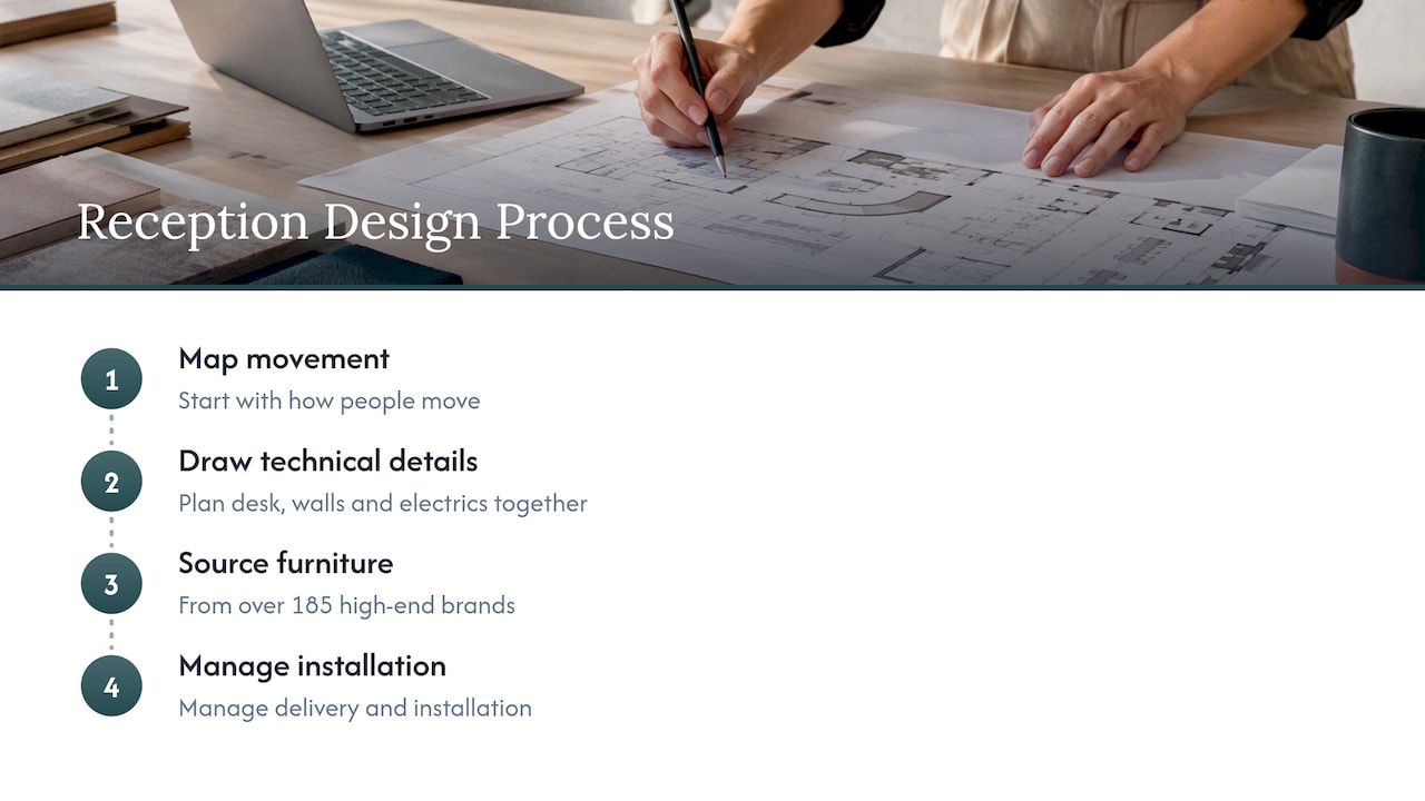
Because we work as both architects and interior designers, we can think about the desk, the walls, the electrics and the furniture as one design. That matters at reception: a beautiful desk with no planned cable route or no accessible section is a problem you only discover on installation day. We start with how people move, then draw the technical details, then source furniture from our network of over 185 high-end brands, and we manage the delivery and installation so you aren't coordinating five suppliers.
Our advice is always the same. Spend your energy on three things: a desk that works for the person using it, light that makes people look and feel good, and one confident design idea that says who you are. The rest is detail, and details are the fun part.
— Giorgia D'Amico
A realistic planning sequence
- Brief: list who visits, how many, and what your team does at the desk.
- Measure and zone: mark the entrance, doors, lifts, daylight and fixed services on a plan.
- Check the rules: discuss SIA 500, fire protection and workplace requirements with your architect or building owner.
- Concept and visualisation: look at materials, colours and light in 3D before you commit. It is far cheaper to move a wall on screen.
- Technical drawings and sourcing: desk details, electrics, lighting positions and furniture lead times.
- Installation and styling: delivery, assembly, final light adjustment and the finishing touches.
Leave extra time for custom joinery, because made-to-measure desks take longer than catalogue items. Your supplier or designer will give you the current lead times.
Working with us on your Zürich reception
If you're planning a new office or refreshing an existing one, our office design service covers space planning, material selection, furniture sourcing, 3D visualisations, technical drawings, delivery, installation and full project management. For a first look at your entrance before committing to a project, you can book a consultation for CHF 490, one of the fixed-price options on our interior design packages page. For larger or more individual briefs, we prepare an individual offer.
FAQ
How big should a reception area be?
There is no single number, because it depends on visitors, staff tasks and the building. A small office can work with a compact counter and two seats, while a busy company needs separate greeting and waiting zones. Start by counting your typical peak visitors, then plan walking routes first and furniture second.
What height should a reception desk be in Switzerland?
Under SIA 500, reception counters in settings such as hotels, consultation and sales must be usable by all, including seated, with a manoeuvring area of at least 1.40 m by 1.70 m on the client side. Practically, that often means a lower section in addition to a standing-height one. Your architect can confirm the exact dimensions that apply to your building.
Which lighting works best in a reception?
Layered, warm light works best: soft general light, focused light on the desk and accents on walls or art. Avoid harsh fluorescent light and use dimmable or adaptive fittings so you can adjust the mood through the day.
Can I design the reception myself?
Yes, for small refreshes such as new seating, lamps and a plant. For anything involving a new desk, electrics, accessibility or fire-protection requirements, it pays to involve an interior architect early, because mistakes in these areas are expensive to correct.
What mistakes should I avoid?
The common ones are a desk that blocks the door, seating that narrows the walking route, cables left visible, and lighting that is bright but not warm. A clear plan and a short checklist catch most of them before installation.
Sources
- Reception Area Design: Making Strong First Impressions
- Der Empfang für den entscheidenden positiven Eindruck
- Rezeption neu denken: Wie Raumgestaltung Vertrauen schafft
- Space Planning Guidelines
- How to Create a Welcoming Reception Area
- Guichets, comptoir de réception et terminaux
- Empfangsbereiche in Unternehmen planen
- Beleuchtung Empfangsbereich | Signify Schweiz
- Environnement de travail : Bases légales (SECO)
- Grossraumbüros (SECO)
- Office Space Planning: A Practical Guide for Owners
- Keep Reception Sightlines Clear: Office Flowers Under 12 Inches
Recommended
- Office Acoustics in Zürich
- Interior Design Zurich
- Benefits of Professional Space Planning for Business Leaders