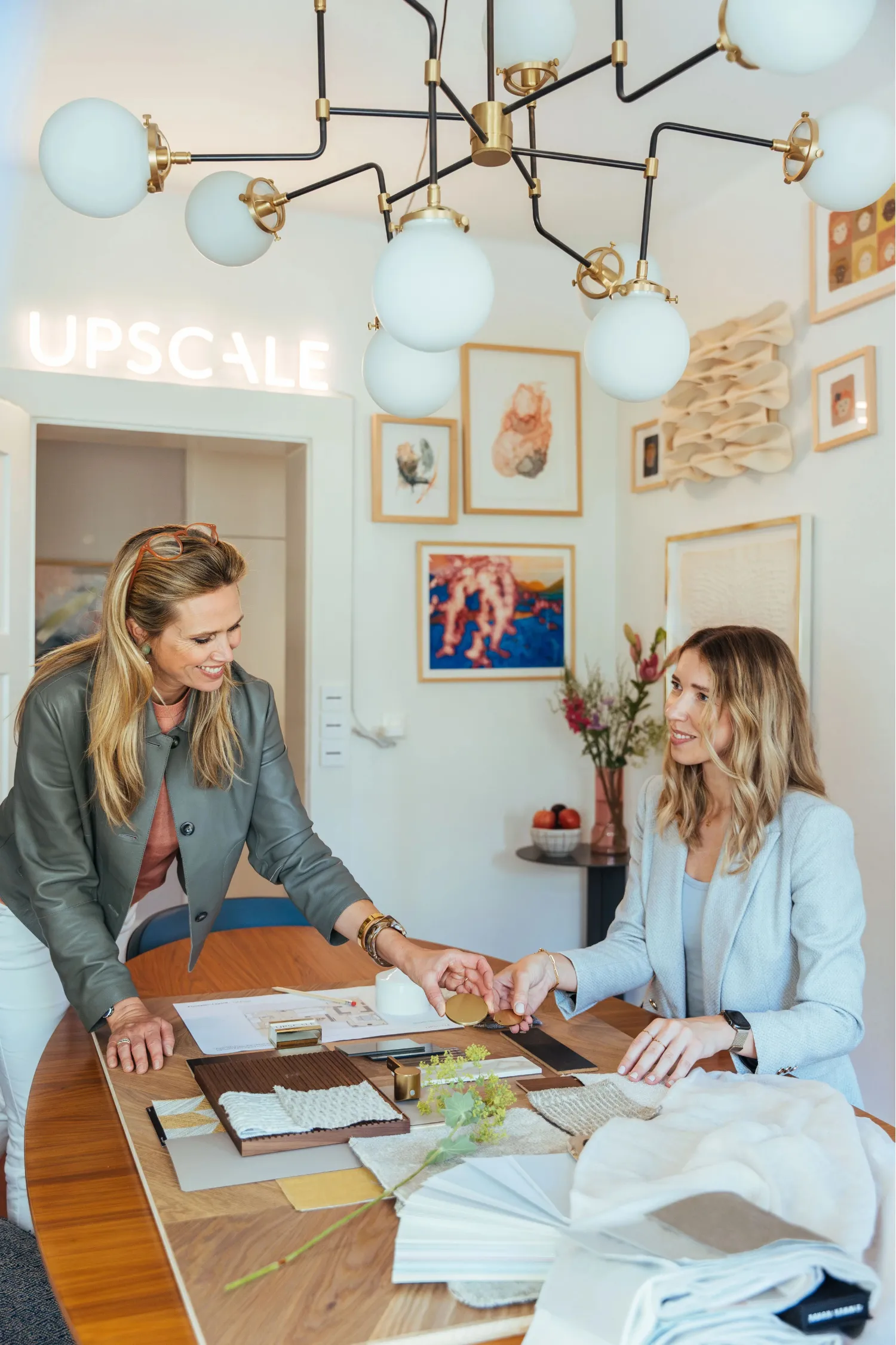
An interior design moodboard is a curated collection of colours, materials, textures, furniture and images that shows how your home should look and feel before you buy a single thing. To make a good one, start with a short written idea of how the space should feel, collect images and samples against it, edit hard, and arrange what's left around one hero image. Whether you live in a lakeside flat in Zürich or a family house on the Zürichberg, the method is the same, and we'll walk you through it.
Upscale Interiors
upscale.ch
Turn Your Moodboard Into a Home
Upscale Interiors offers tailored interior design and architecture for Zürich homes, with space planning, material selection and 3D visualizations.
TL;DR
- A moodboard turns a vague feeling ("cosy but calm") into something you, your partner and your designer can all see and agree on.
- Start with words, not pictures: describe who uses the room and how it should feel, then pick three to five keywords to test every image against.
- Keep it small: one hero image, a handful of materials, a limited palette and two or three anchor furniture pieces.
- Add real samples whenever you can, because fabrics and finishes look different on a screen than in your living room.
- If you'd like a professional to turn your board into a finished plan, our online consultation costs CHF 490.
What an interior design moodboard actually is
Think of a moodboard as the bridge between your imagination and the finished room. It's an assemblage of colours, textures, prints, materials and other design elements that together make up a project's identity, as ArchDaily describes it. It helps with ideas and inspiration, explains a concept to people who weren't part of the process, and can feed later visualisation and rendering.
For you as a homeowner, the biggest benefit is alignment. A professional design-software guide points out that moodboards bridge the gap between a designer's vision and a client's expectations, and help everyone agree before the final commitment. That's exactly what saves you from the dreaded "it looked different in my head" moment when the sofa arrives.
It also fits with something we talk about often: a room is never just visual. How a space feels shapes how you feel in it, which we explore in our piece on why interior design is more than visual. A moodboard is the first place where that feeling becomes concrete.
Concept board or moodboard?
You'll see both terms, and they're not quite the same. According to a Houzz Pro article, a concept board communicates the overall tone of a space, while a moodboard translates that direction into concrete products, furnishings, finishes and fixtures for a specific project. The two work well in sequence: the first sets the emotional direction, the second grounds it in choices you can actually make for a particular room.
In practice, most homeowners begin with a loose concept board (lots of images, lots of feeling) and then tighten it into a moodboard with real products and samples. Both are fine. Just know which one you're making.
Before you collect anything: ask four questions
It's tempting to open Pinterest and start saving. We'd gently suggest you pause first. ArchDaily recommends asking who uses the space, what they do there, how they should feel, and what the project should remind them of, all before you gather references. Source
Here's how that might sound for a Zürich apartment:
- Who uses the room? Two adults who work from home and host friends on weekends.
- What do they do there? Read, eat, video calls, long dinners.
- How should it feel? Warm, quiet and a little bit luxurious.
- What should it remind you of? A mountain hotel in winter, perhaps, or a Scandinavian summer house.
From those answers, write a two or three sentence concept. Then pull out three to five keywords, such as "soft", "timber", "layered", "evening light". A moodboard guide from a design-tool company suggests using those keywords as a quality-control check: every image, material and colour has to support the stated users, atmosphere or constraints. If it doesn't, it goes.
How to make your moodboard, step by step
There's no single correct process, but this sequence combines what the guides agree on with what we see work with our clients.
- Decide what the board is for. One option is to explore style and mood, another is to specify practical products, and a third is to do both in sequence. A step-by-step guide from a visual-collaboration tool recommends choosing before you start.
- Name the board and jot down first ideas. Add your brief, your keywords and anything you already own that stays.
- Gather widely. Don't limit yourself to photos of rooms. Home Beautiful suggests drawing on interiors, nature, cities, architecture, fashion, food, artwork and found objects.
- Look for the pattern. Homes to Love advises spotting the colour, furniture style, pattern, stone or material that keeps appearing in the images you're drawn to, then removing references that don't support that emerging look.
- Experiment with colour. Try your palette in different proportions before settling.
- Arrange with hierarchy. Decide which element leads and which supports.
- Explain your thinking. Add a line or two on why each piece is there.
- Ask for feedback. Show it to your partner, your family or your designer before you buy anything.
That last step is where many people stall. If you'd like a second pair of eyes, our interior design consultation is designed for exactly this stage.
What to put on the board
A common mistake is to include everything you like. A strong board is edited. Different sources suggest slightly different numbers, so treat these as sensible ranges rather than rules:
These figures draw on a guide to interior mood boards, which proposes a three-to-five-colour palette, one to three hero materials and two or three anchor furniture pieces, and on another guide that suggests a four-to-six-tone palette and reducing most strong boards to six to twelve images.
Samples beat screenshots
If you can, add physical samples: tile, stone, paint, wood stain and fabric. Homes to Love suggests cutting samples to sizes that reflect their approximate scale in the room, so a big floor tile looks big and a small mosaic looks small. Source ArchDaily also likes touchable three-dimensional elements such as textured materials, plants and accessories on physical boards. Source
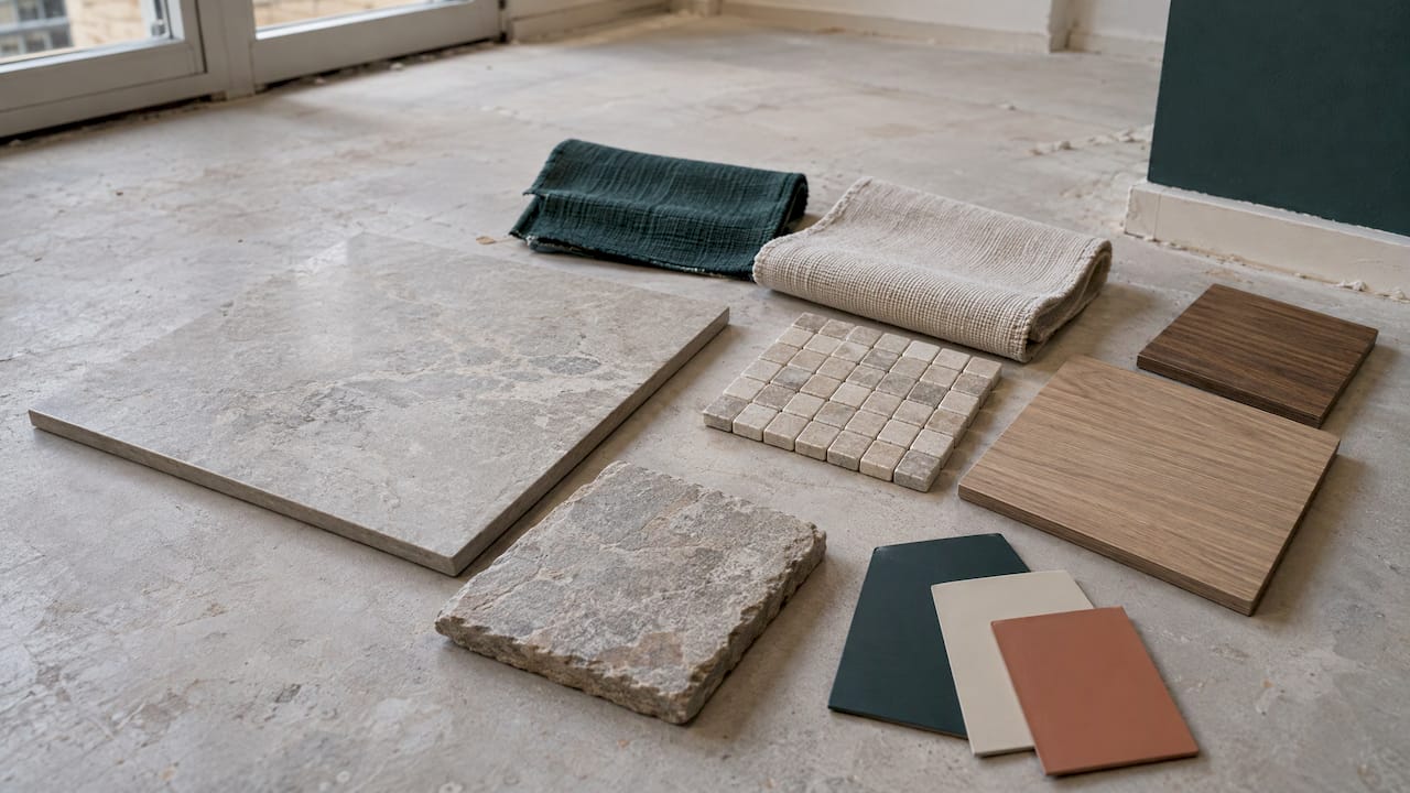
This matters even for professionals. Designers interviewed by Architectural Digest stress that fabrics and finishes aren't fully realised digitally, which is why a good remote presentation combines clear visuals with material samples where possible. In Zürich, a short trip to a showroom to touch a few fabrics and oak finishes is often the most useful hour of the whole process.
Colour: keep it to a clear hierarchy
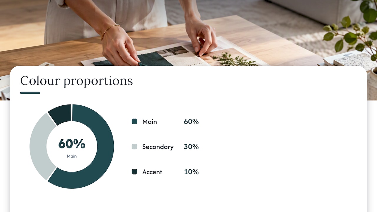
Colour is where boards most often go wrong, because every inspiring image has its own palette. Pick a main colour, a secondary and an accent, then check that they all appear in the board in sensible proportions. The classic 60/30/10 split is a handy starting point, and it's illustrated neatly in this guide to the 60/30/10 colour rule for bedding, which shows how the idea works on a bed.
If you're repainting, take a look at our article on wall colours and when it's time for a change before you commit to a shade.
How to arrange it so it tells one story
A pile of pretty images isn't a concept. Arrangement is what makes your board read as a story.
- Lead with the hero image. Make it the largest element and let the rest support it. A moodboard guide recommends clustering supporting images by theme and keeping margins and gutters consistent. Source
- Show hierarchy through size and position. Anchor the board with a key element, then vary the size and position of the others to show importance and relationships. Source
- Group by type for decision boards. A professional moodboard guide suggests orderly rows or columns, for example separating paint and material swatches, large furniture, medium accessories and small accessories.
- Use white space and few labels. Breathing room lets the images speak.
- Check the light. Photos taken in very different lighting can pull in different directions. Choose images that feel like they belong in the same room.
The real skill is subtraction. One practitioner perspective says content should only stay on the board if it influences a later purchasing or specification decision, otherwise the board turns into an undirected collage. Source That's a rule we happily apply to our own work.
Physical or digital: which should you choose?
Both work, and many people use both. Home Beautiful contrasts physical boards, such as scrapbooks, pinboards or trays with tangible samples, with digital boards, which are easier to edit, share and access while sourcing. Source It names general-purpose tools like Pinterest and Canva as common starting points.
A few things digital boards do especially well:
- They can hold product links, video and evolving content, and double as a visual inventory of what you plan to buy. Source
- They're easy to share with a partner or designer in another city, which suits an international household.
- AI tools can now generate mood images, material worlds and style directions. A Swiss provider based in Baar describes AI moodboards for architecture and interiors with export, sharing and team collaboration.
Our advice? Use digital to explore quickly and physical to decide. Screens are great for "does this direction feel right?" and samples are best for "is this exact oak the one?"
Our perspective
We've worked on more than 480 projects, and the ones that go smoothest almost always start with a clear moodboard. Not because the board is magic, but because it forces a conversation early, when changes cost nothing.
Here's what we've learned. Clients rarely struggle to say what they like. The hard part is bringing the dots together: the sofa from one picture, the stone from another, the lighting from a hotel they loved. A moodboard is where those dots meet, and an experienced designer can spot where they clash long before anything is ordered.
That's why we combine architecture and interior design under one roof. Colours and materials look different once you factor in room proportions, daylight and how you move through a home. Our approach is to take your board seriously as a brief, then add spatial planning, 3D visualisations and access to our network of over 185 furniture brands, so the picture becomes a room that works.
If you're sitting on a Pinterest board with 300 pins and no idea where to begin, that's completely normal, and it's a great place to start. We'd love to help you edit it down to what really feels like you.
Giorgia D'Amico
From board to finished home: how we can help
Not everyone wants to do this alone, and you don't have to. We offer a few ways in, all with published prices on our interior design packages page:
- Consultation, CHF 490. A focused session to review your board, sharpen the concept and plan next steps.
- Single Area Package, CHF 970. A fixed-price online package for one room, from the Single Area Online Package.
- Full Home Package, CHF 3390. A whole-home concept, from the Full Home Online Package.
For larger or more bespoke projects, we also offer an individual offer, and you can browse more ideas, like how to decorate your room, in our magazine.
Making a moodboard work in a Zürich home
A few practical notes for the city and its lake-side suburbs, based on what homeowners typically ask us:
- Test samples in your own light. Tape paint swatches and place fabric near the window you'll use most, and look at them in the morning and evening. Light changes colour more than most people expect.
- Respect the architecture. Many Zürich homes mix older character with newer fittings. Let your board acknowledge what stays, such as parquet floors or built-in joinery, rather than pretending you're starting from scratch.
- Plan for flexible zones. If you're working with an open-plan space, consider how furniture or screens divide it. Our guide to room dividers without renovation has simple ideas.
- Think about lead times. Quality European furniture is often made to order, so put the anchor pieces on your board early and confirm availability before you fall in love.
- Be honest about budget. Add product links and rough prices to your board so it's a plan, not a wish list.
Mistakes we see again and again
- Too many styles. If your board mixes modern glam, farmhouse and Scandinavian, pick a lead style. Not sure which one you are? Our online style quiz can help you find out.
- No hierarchy. If everything is equally prominent, nothing is.
- Only pretty pictures. Without materials, sizes and products, the board can't guide real decisions.
- Skipping scale. A small swatch can make a bold pattern look safe. Check it at actual size.
- Never editing. Return to your keywords and remove anything that doesn't fit. It's the quickest way to make a board better.
FAQ
What should be on an interior design moodboard?
A hero image, two or three spatial references, a small colour palette, one to three hero materials, supporting textures, a couple of anchor furniture pieces and lighting. Samples of tile, paint, wood and fabric make it far more useful. Keep it to six to twelve images so every item has a purpose.
How many colours should a moodboard have?
Most guides recommend a palette of about three to six colours, with one dominant, one secondary and an accent. Using a proportion such as 60/30/10 helps the room feel balanced. Test your choices in your own daylight before you buy paint or textiles.
Should I make a physical or a digital moodboard?
It depends on the stage. Digital boards are quicker to edit and share, and they can store product links, while physical boards let you touch and compare real samples. Many people explore digitally and then confirm choices with physical samples.
What's the difference between a moodboard and a concept board?
A concept board sets the overall tone and feeling of a space. A moodboard turns that direction into specific products, finishes and fixtures for a particular room. You can make them one after the other, so the concept leads into the practical choices.
Can a designer help me with my moodboard?
Yes. A designer can help you edit your references, spot clashes, check scale and turn the board into a plan with 3D visualisations and sourcing. Our consultation at CHF 490 is a good first step if you already have a board and want expert feedback.
Sources
- The Art of Visual Communication: 12 Tips for Creating Powerful Mood Boards, ArchDaily
- What Is the Difference Between a Concept Board and a Mood Board, Houzz Pro
- 7 Moodboard Layouts for Interior Designers, DesignFiles
- The Professional's Guide to Interior Design Moodboards, DesignFiles
- How to Make an Interior Design Mood Board, Rayon
- How To Make an Interior Design Moodboard: Step-By-Step Guide, Milanote
- How To Create A Mood Board, Home Beautiful
- Interior Design 101: How to make a moodboard, Homes to Love
- Interior Design Mood Boards: Examples, Process, and Tools, Matterbase
- How to Ace Your Next Client Presentation, Architectural Digest
- AI Moodboard for Architecture, Vizera
- 60/30/10 Bedding Color Combinations That Work, Roomie Design
Recommended