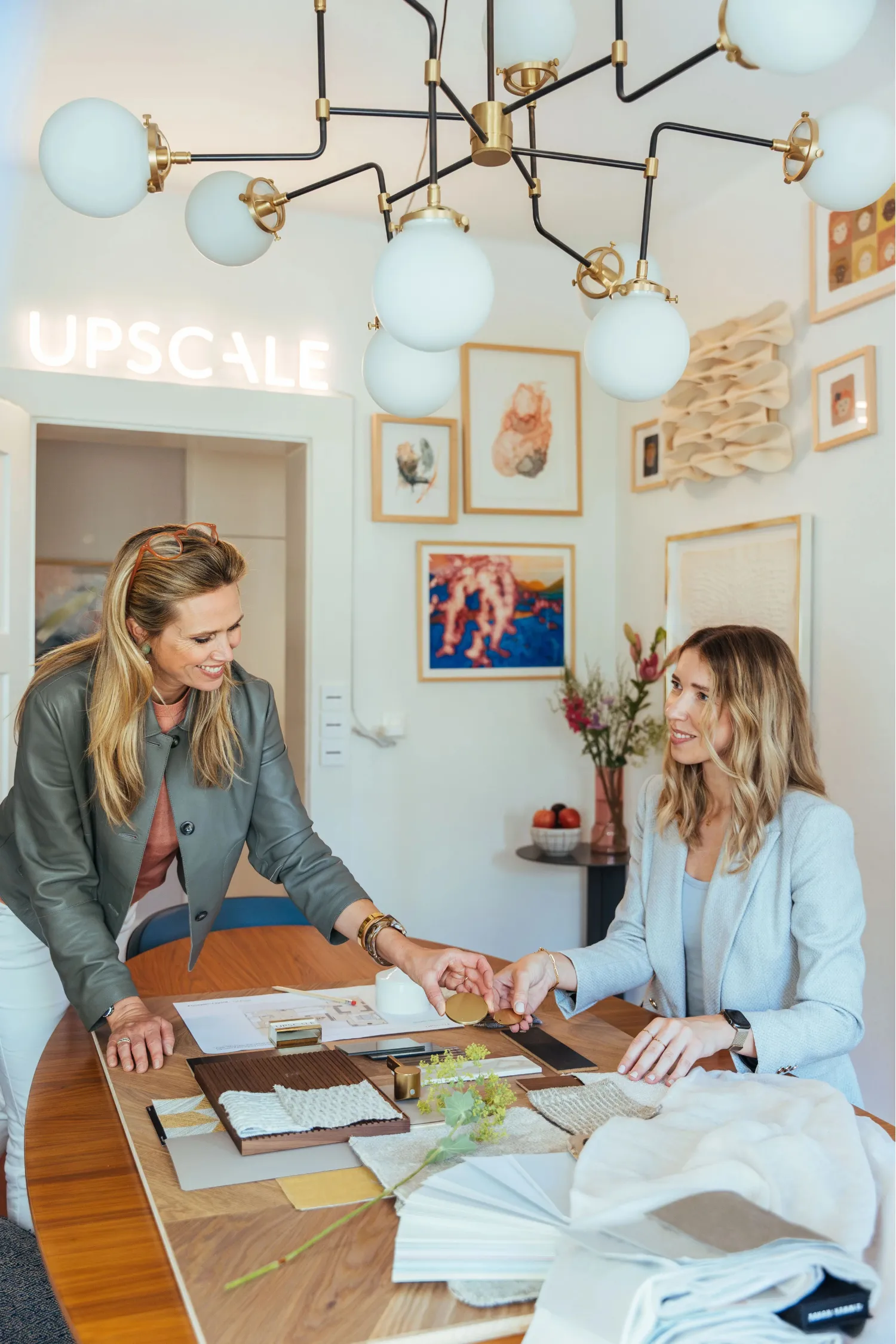
An interior design style spectrum organises related aesthetics along a continuum, so you can recognise, compare and mix looks that suit your taste. Swiss residential quality frameworks such as the WBS put function and materials ahead of labels, and we at Upscale Interiors use the same logic. Here you get the archetypes, twelve profiles and a method for finding yours.
TL;DR:
- Swiss housing assessments such as WBS prioritize daily function, spatial quality, and material longevity over appearance or fashion when judging a style for a home.
- Collect ten images, mark recurring colors, materials, and lines, then write a brief in three lines covering mood, finishes, and essential functions.
- When mixing styles, anchor the room with one large piece, repeat a material three times, and limit the palette to two or three tones.
- Set room priorities: comfort and seating in living areas, durable surfaces and workflow in kitchens, and soft textures, dimmable light, and quiet colors in bedrooms.
- Treat light, touch, and sound as part of the material palette; rugs and curtains soften acoustics, while finishes that develop a patina can age gracefully.
Upscale Interiors
upscale.ch
Find a Style That Fits Your Space
Upscale Interiors pairs personalized interior design with space planning and material selection to shape tailored residential and commercial spaces.
1. How the interior design style spectrum works
Think of the spectrum as a map rather than a menu. Instead of memorising dozens of trend names, you place each look between a handful of root archetypes and read its neighbours. A handful of anchors do most of the work:
- Historical and classical: symmetry, ornament, timber and stone with a sense of heritage.
- Modernism and the 20th century: clean lines, honest structure, function leading form.
- Transitional and hybrid: a calm blend of old and new, often the most liveable middle ground.
- Regional and vernacular: local materials, colours and craft traditions that give a place its character.
- Eclectic and expressive: layered, personal, collected over time.
Most named styles sit between two anchors. Japandi, for example, lives between modernism and regional warmth, while modern glam borrows classical drama with a contemporary edge. Once you see that, comparing styles becomes simple: you ask which anchor a look leans towards and what it borrows from the next one.
Swiss practice adds a useful filter on top. The WBS housing assessment prioritises functionality, spatial quality and the longevity of materials, not appearance alone. So a style is not "good" because it is fashionable. It earns its place when it works for daily life and continues to feel right over time.
2. Twelve common styles, side by side
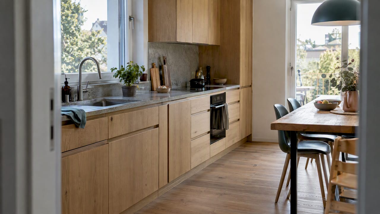
Each profile below follows the same pattern: what it is, what it is made of, what you will find in the room and how to spot it.
- Minimalist: Pared back and calm. Think white or soft neutral walls, matte surfaces and concealed storage. Furniture is low and simple. It looks like a room where every object has been chosen on purpose.
- Scandinavian: Light, practical and warm. Pale oak or ash, wool and linen, soft whites and greys. Expect slim-legged chairs and layered textiles. It looks like a bright room you want to linger in.
- Mid-century modern: Sculptural and optimistic. Walnut and teak, tapered legs, curved plywood, mustard and olive accents. It looks like a sideboard you would keep for decades.
- Contemporary: Current rather than historical, so it keeps shifting. Neutral palettes, large-format surfaces, sleek lighting and open plans. It looks polished and uncluttered.
- Industrial: Raw and structural. Exposed concrete, black steel, aged leather and reclaimed timber. It looks like a converted loft with its bones on show.
- Bohemian: Free and layered. Rattan, kilims, plants and richly patterned textiles in earthy, saturated colours. It looks collected, lived in and personal.
- Traditional and classical: Formal and balanced. Panelling, carved wood, damask and brass, with symmetrical furniture groupings. It looks like a room with a story.
- Transitional: The diplomatic middle. Classic shapes in simplified form, neutral tones, mixed metals. It looks timeless without feeling dated.
- Japandi: Japanese restraint meets Scandinavian warmth. Low furniture, ash and oak, paper-like lighting, muted earth tones. It looks serene and quietly crafted.
- Modern glam: Luxurious with a contemporary pulse. Velvet, mirror, marble, brass and statement chandeliers. It looks like an evening out, at home.
- Rustic and farmhouse: Honest and cosy. Chunky timber beams, stone, linen and enamel details. It looks like an Alpine chalet or country kitchen with a roaring fire nearby.
- Art deco: Geometric and glamorous. Fan motifs, lacquer, rich jewel colours, metallic inlay and bold symmetry. It looks theatrical and confident.
Doors are a good place to see these signals in practice. A flat slab reads minimalist, while panelled doors lean traditional, and this guide to choosing an interior door style shows how much a single element can shift a room's character.
3. How do you find your own style?
Start with a quick audit. Write down your answers to six prompts:
- The rooms you love most, and why.
- Your daily routines, such as how you cook, work and unwind.
- Must-have functions, like hidden storage or a reading corner.
- The colours you keep reaching for.
- The textures you enjoy touching.
- The furniture silhouettes you keep returning to, whether low and sculptural or tall and classic.
Then build a moodboard in six steps:
- Collect ten images of rooms, objects or materials that make you pause.
- Lay them out together and look for repeats in materials, lines and colours.
- Circle the repeating elements and label each one in a single word.
- Place those words among the archetypes to see where your taste clusters.
- Remove one image that does not fit and notice what it tells you.
- Write a three-line brief: the mood, the materials and the must-have functions.
Pro Tip: Photograph your own home and add those images to the board. What you already own often reveals your style faster than any Pinterest scroll.
If you want a quicker route, our style quiz maps your answers to a style direction. A consultation is the next step when you would like a designer to turn that direction into a plan.
4. How can you mix styles without a muddle?
Hybrids work when one thing stays consistent. Industry experts speaking at a design panel in Zürich describe successful projects as hybrid ones that harmonise historical fragments, contemporary materials and functional clarity into a personal result. A few rules help you get there:
- Anchor with scale. Choose one large piece, such as a sofa or dining table, and let smaller items play around it.
- Repeat a material three times. Oak in a table, a shelf and a frame ties very different shapes together.
- Unify with colour. A restrained palette of two or three tones holds the look steady.
- Plan the light and rhythm. Layered lighting and evenly spaced focal points keep a mixed room calm.
Familiar hybrids prove it works: mid-century armchairs in a contemporary living room, or older parquet paired with contemporary lighting. Room by room, in living areas put comfort and seating first. In kitchens, prioritise durable surfaces and workflow. In bedrooms, go for softness, dimmable light and quiet colour. Even a single architectural feature can carry a style, as this media wall panelling guide shows.
5. Why do materials and surfaces matter so much?
Style labels describe the look, but atmosphere comes from what surrounds you. Practitioners interviewed by Metropolis describe material, light, haptics and acoustics as compositional elements, often adjusted during a project rather than fixed in an initial visual plan.
Atmosphere is composed, not just chosen: designers treat material, light, touch and sound as a single composition that needs refining as work progresses, according to Metropolis.
That matches a wider Swiss shift towards reused components and local natural materials that give interiors regional depth. Practically, favour durable natural materials, add acoustic softness through rugs and curtains, and pick finishes that develop a patina instead of showing wear.
6. Why context beats strict labels
I rarely meet a client who fits one style neatly, and I have stopped expecting them to. The spectrum is a tool, not a verdict. What holds a home together is atmosphere, materials and how well it serves daily life. If your quiz result or moodboard leaves you with a clear preference, bring it to a conversation, and we will shape it into a brief that fits your space.
FAQ
What constitutes interior design?
Interior design is the planning and styling of a space so it works well and feels right to live in. It covers layout, materials, colour, lighting, furniture and decorative details. In Swiss practice, functionality, spatial quality and material longevity are central criteria.
What is my interior design style quiz?
A style quiz asks about your preferences and maps them to a recognised look, such as Scandinavian or transitional. Ours is a quick starting point, and you can then use a moodboard to confirm the result. If it points to a blend, that is normal.
What is the 3-5-7 rule in decorating?
It is a styling guideline that groups decorative objects in odd numbers. Some people find odd groupings easier to balance on shelves and tables, but treat the idea as a rule of thumb, not a requirement.
How do I choose between two very different styles?
Find what they share, such as a material, a colour or a silhouette, and build from that overlap. Then let one style lead and the other accent. A moodboard test helps you see which direction you return to.
Sources
- Wohnungs-Bewertungs-System WBS
- Die dritte Umdrehung -
- A Passion for Design Podiumsgespräch bei wohnbedarf Zürich | Espazium
- Metropolismag